Mobile experience
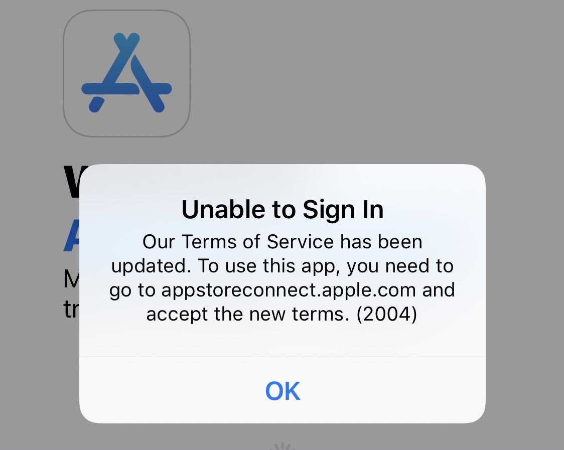
Apple changes Terms of Service and me, as a paid Developer Program Membership have to accept new agreement. So I open App Store Connect app - introduced in Jan 4, 2018 - so pretty new product. Not new enough to display web view with an agreement text and "Accept" button. For that, I'm redirected to the https://itunesconnect.apple.com website:

Mobile Web experience
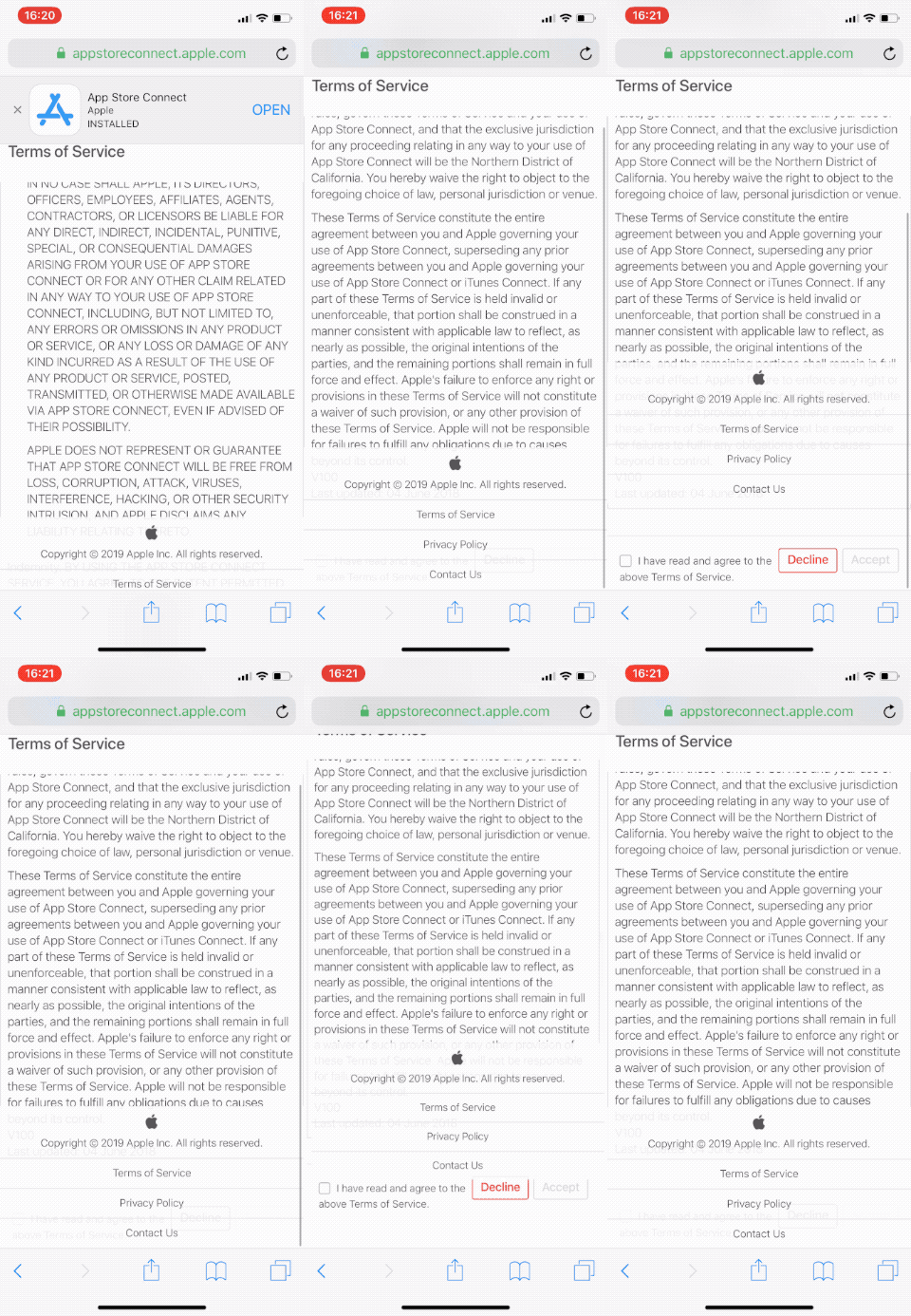
So I did. The website is not optimized for iPhone though. iPhone X in my case is not compatible with the website of the company that iPhone business is like what... 80% of revenue?
I recorded my annoyance: the bottom part of the website covers the part where "Accept" button is located. Also, scrolling is very hard (unlike iPhone scrolling at all).

Fun part: the website suggest to open App Store Connect, yea right!
Web experience
This is why I need my Mac. To open the Apple websites. So I did open https://itunesconnect.apple.com, log in, and click at "Accept" butto of the Terms of Service screen, then this happened:

😤😤😤
After another sign-out (reboot website experience?) and sign in, I managed to access my account. I wanted to add new bank account for my "revenue". To do this I can
- delete bank account
- edit current account
- replace with new account
what missing? simply add an account, because this list can have more than one row.

Anyway, I decided to "replace with new account:

turns out mission impossible. The form has some fields that I don't understand, and error messages mention fields that are missing (find SWIFT code field mentioned in the error message).
Summary
It took Apple ~10 minutes to left me very pissed, and I was not able to complete basic task. I pay 99 USD/year for this, for the last 10 years. Apple is one of the richest company in the world. So it's neither a new product, nor free service - it's simply UX from hell.
Retorical question: How this mess is even possible. Some say mobile is where Apple money are. Why they don't care about mobile they create? Apple is doomed.